Redesigning Trust for a Life Insurance Brand
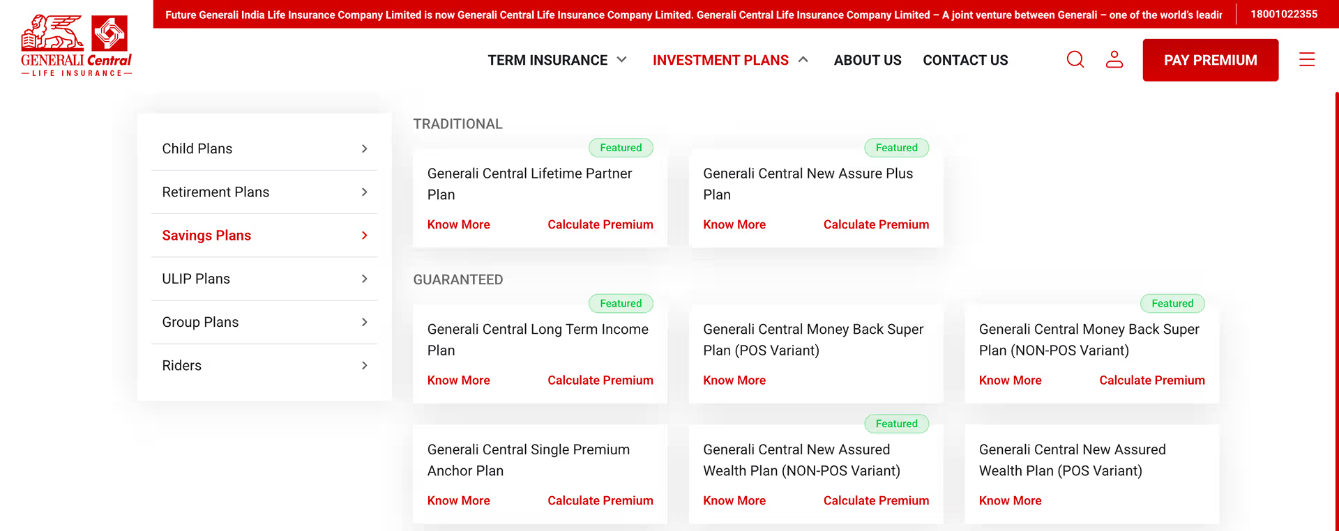
Generali Central Life Insurance
Timeline
2025-26
Role
UX Designer
01 PROJECT OVERVIEW
Where It All Began?
The client, the context, and the challenge.
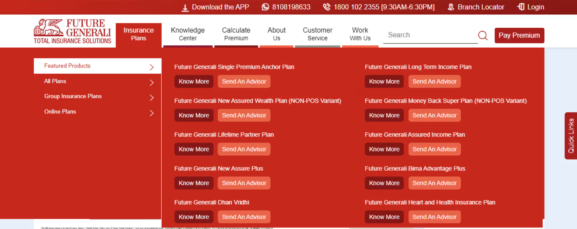
THE CLIENT
Generali Central Life Insurance
Formerly Future Generali India Life Insurance — a joint venture between Generali, one of the world's largest insurance groups founded in 1831, and Central Bank of India, one of the country's oldest nationalised banks with 6,000+ branches.
They offer Term, Savings, Child, Retirement, ULIP, and Group plans — serving close to 9 lakh lives across India with a 98.08% individual claim settlement ratio.
50+
Countries — Generali
Global Presence
6000+
Generali Central &
Partner Branches
1M+
Lives Protected
Across India
THE PROBLEM
A Website Built for Products, Not People
The existing website was purely transactional — it pushed products without educating users, leading to high bounce rates and low trust among first-time buyers. The UI was outdated, navigation cluttered, and the experience had no mobile-first thinking.
Most critically, there was no customer-facing way to buy insurance online. The entire purchase journey ran through agents — leaving digitally-intent users with nowhere to go once they decided they were ready.
✕ Unintuitive Navigation
Key areas inaccessible without an extra click.
✕ Inconsistent Menu Design
Navigation labels reflect products, not user goals.
✕ No Personalisation
Same content shown to all users regardless of intent.
✕ Broken Buy Journey
Journey unavailable or leads to wrong page.
✕ Poor Visual Hierarchy
Mixed fonts and inconsistent sizing across the page.
✕ Accessibility Issues
Poor contrast and non-responsive on mobile devices.
The Goal
Three Interconnected Challenges
To move forward, we had to set three clear goals — each one directly addressing a gap the existing website had left unsolved.
01
Make Insurance Understandable
Give first-time buyers the knowledge they need to make confident financial decisions, not just a list of products to scroll through.
02
Make It Intuitive & Mobile-First
Replace an outdated, cluttered UI with a mordern mobile-first design that works seamlessly across every device and screen size.
03
Create a Buying Journey
Move users from complete agent dependency to a self-serve digital experience, a customer-facing buying journey built from scratch.
02 RESEARCH & DISCOVERY
What the Research
Revealed.
We spoke to 8 participants, studied the market, and reviewed competitors. Every method pointed to the same finding.
Smartphone Ownership
98.4%
of Indians own a smartphone – yet most found mobile insurance experience frustrating and hard to use
Insurance Penetration
38%
of Indians have life insurance — a massive trust gap that digital could either close or widen further
Agent vs. Digital Trust
Trust
Deficit
Users preferred agents — not out of loyalty, but because digital experience hadn’t earned their trust yet
The Critical Insight
Users’ preference for agents wasn’t about channel loyalty — it was a trust deficit. They weren’t saying “I want an agent.” They were saying “I don’t trust this website enough to go further on my own”.
That one insight changed everything about how we approached the redesign.
03 TURNING INSIGHTS INTO DIRECTION
How Research Shaped the Strategy.
Two problems surfaced from research — users didn't trust digital enough to act, and couldn't identify the right plan.
The redesign had to solve both.
Solution 01
Persona-Based Journey
Users identify their current life stage and receive plan recommendations tailored to where they are — young professional, new parent, planning for retirement.
Why this approach
Chosen over a generic list, meets users where they are, not where catalogue starts.
Solution 02
Need-Based Journey
Users start with a financial goal — securing a child’s education, building retirement savings, creating long-term wealth — and work backwards to the right plan.
Why this approach
Chosen over product-first navigation, users arrive with goal, not product a name.
Innovation
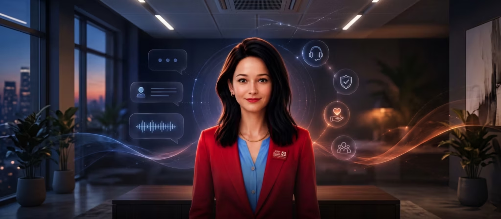
Virtual Digital Assistant
An AI-driven guide that simulates a real agent — available at any point in the journey, answering questions and helping users move forward without pressure.
Why this approach
No competitor had built this, the only AI-driven guide in the life insurance category.
04 DEFINE
Who Are We
Designing For?
Research gave us data. What it gave us more valuably was a person to design for, one consolidated profile that surfaced consistently across every interview, every age group, every city.
Profile
Age – 25 – 55 years
Cities – Metro & Tier 1/2
Gender – Male & Female
Goals
- Plans that cover family security first
- Clear pricing, benefits and coverage
- Financial growth alongside protection
Frustrations
- Product details make comparison impossible
- Confusing interfaces raise more questions
- Very few plans combine growth and protection
Their Real Thoughts 🤔

User
I need to secure my family’s future.

Thinks
Six products. No guidance on which one is right.
User
Can I at least compare the plans?
Thinks
No comparison. No guidance. I’ll just call my agent.
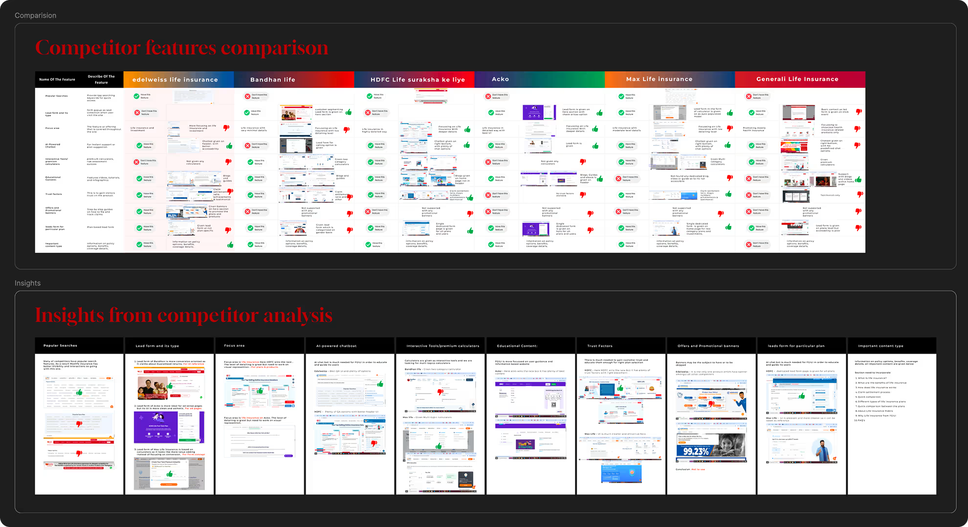
05 IDEATE
Exploring Before Building
Research gave us data. What it gave us more valuably was a person to design for, one consolidated profile that surfaced consistently across every interview, every age group, every city.
| Feature | GCLI | Edelweiss | Bandhan | HDFC Life | Acko | Max Life |
|---|---|---|---|---|---|---|
| Popular Searches | ✕ | ✓ | — | ✓ | — | ✓ |
| AI-Powered Chatbot | ✓ | — | — | ✓ | — | — |
| Interactive Calculators | ✓ | — | — | ✓ | ✓ | — |
| Educational Content | ✕ | ✓ | ✓ | ✓ | ✓ | — |
| Trust Factors | ✕ | — | — | ✓ | — | ✓ |
| Persona-Based Journey | ✓ | — | — | — | — | — |
| Virtual Digital Assistant Only Us | ✓ | — | — | — | — | — |
| Lead Form Type | Generic | Generic | Specific | Specific | Minimal | Specific |
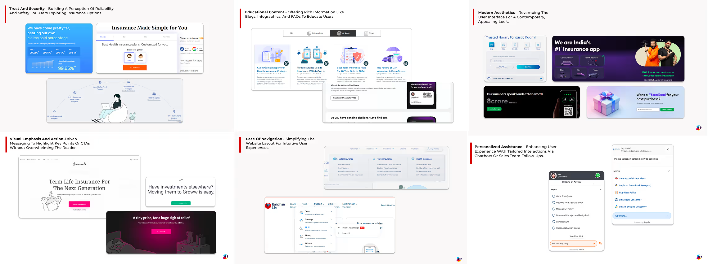
Design Philosophy
Six principles that every screen, component, and interaction had to pass through.
01
Professional & Approachable
Clean and uncluttered, modern but not cold, reflecting professionalism without feeling distant.
02
Human-Centric Imagery
Diverse families, individuals, and professionals, imagery users could see themselves in.
03
Logical Structure
Modular, intuitive layouts with clear groupings, easy to update and scale as content evolves.
04
Interactive Elements
Premium calculators and financial tools designed with clarity in input fields and results.
05
Trust Signals
Certifications, awards, claim ratios and success stories made visible at the right moments.
06
Accessibility
Designed for everyone, not just the digitally confident — with inclusive patterns throughout.
Theme Exploration
Three visual themes were developed and evaluated before arriving at the final direction.
Selected
Mars Theme
Clean layout, prominent lead form, relatable imagery, brand colors on CTAs.
STRENGTHS
✓ Standardized approach — fast to implement and scale
✓ Predefined templates ensure consistent navigation
Limitations
✕ May feel less engaging compared to modern trends
✕ Limited customization for evolving user needs
Considered
Orbit Theme
User-centric journeys, 3D avatars, minimal aesthetic, mobile-first design.
STRENGTHS
✓ Sleek design aligned with current UX/UI trends
✓ Strong persona focus leads to higher user satisfaction
Limitations
✕ Prioritises user needs over lead capture
Considered
Galaxy Theme
3D avatar-led engagement, clear hierarchy, well-defined CTAs for better conversion.
STRENGTHS
✓ Highly engaging — creates memorable user experience
✓ Assistive agent journey adds personalised touch
Limitations
✕ 3D assets increase page load time on slower networks
Why Mars
Mars solved for trust, speed, and conversion – the three things that mattered most to GCLI’s first-time buyers and the client’s business goals.
Galaxy risked performance on mid-range devices. Orbit deprioritised lead capture. Mars balanced both without compromise.
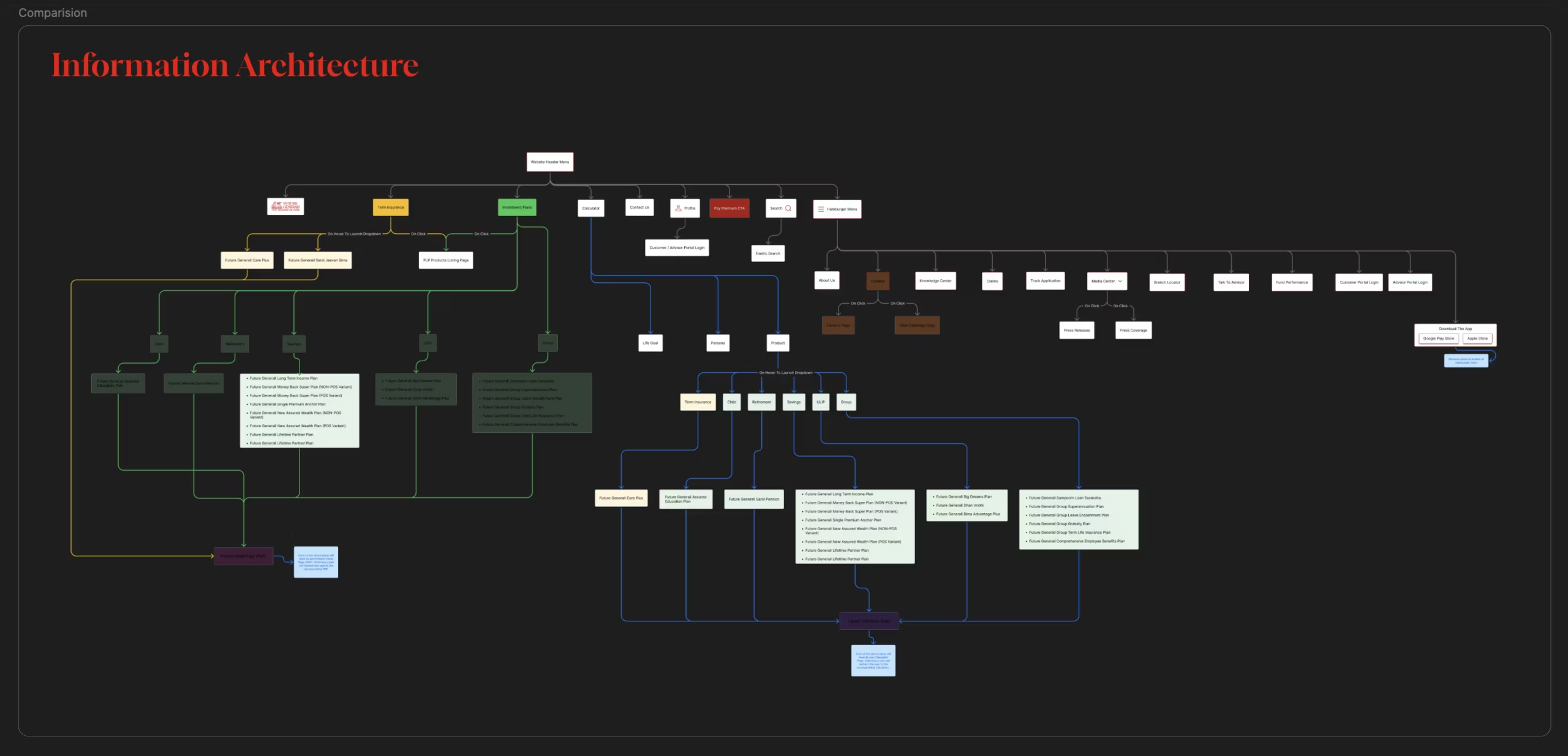
06 STRUCTURE
How We Restructured the Navigation.
Old navigation reflected how GCLI organised its products internally, not how users think about insurance.
Before Redesign
What was broken
- Main menu hidden behind a click — users couldn’t see options upfront
- Navigation labels reflected internal categories, not user goals
- No mental model match — users think in goals, not product types
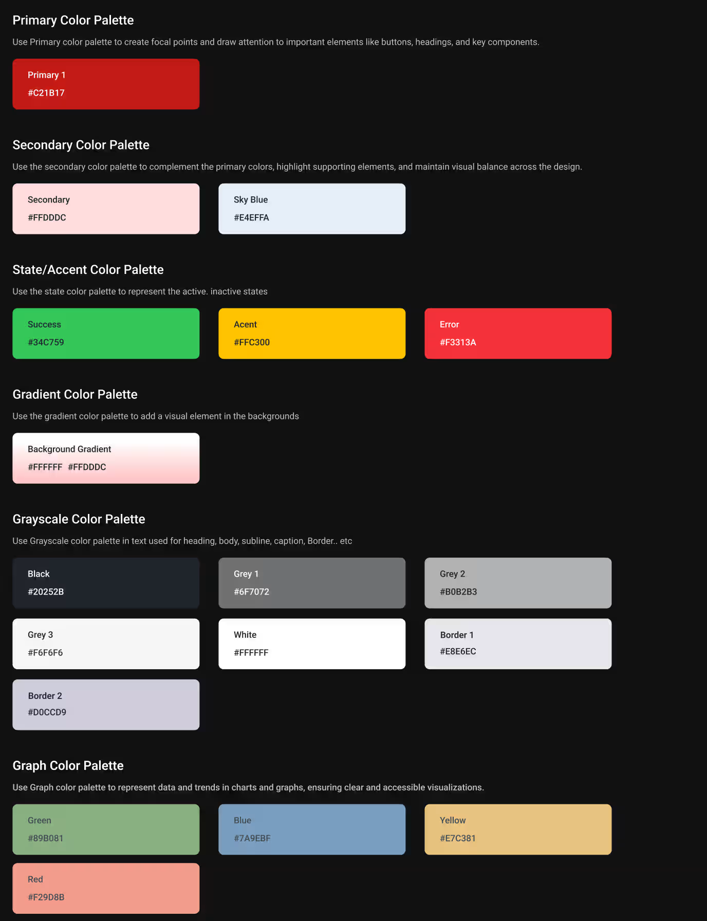
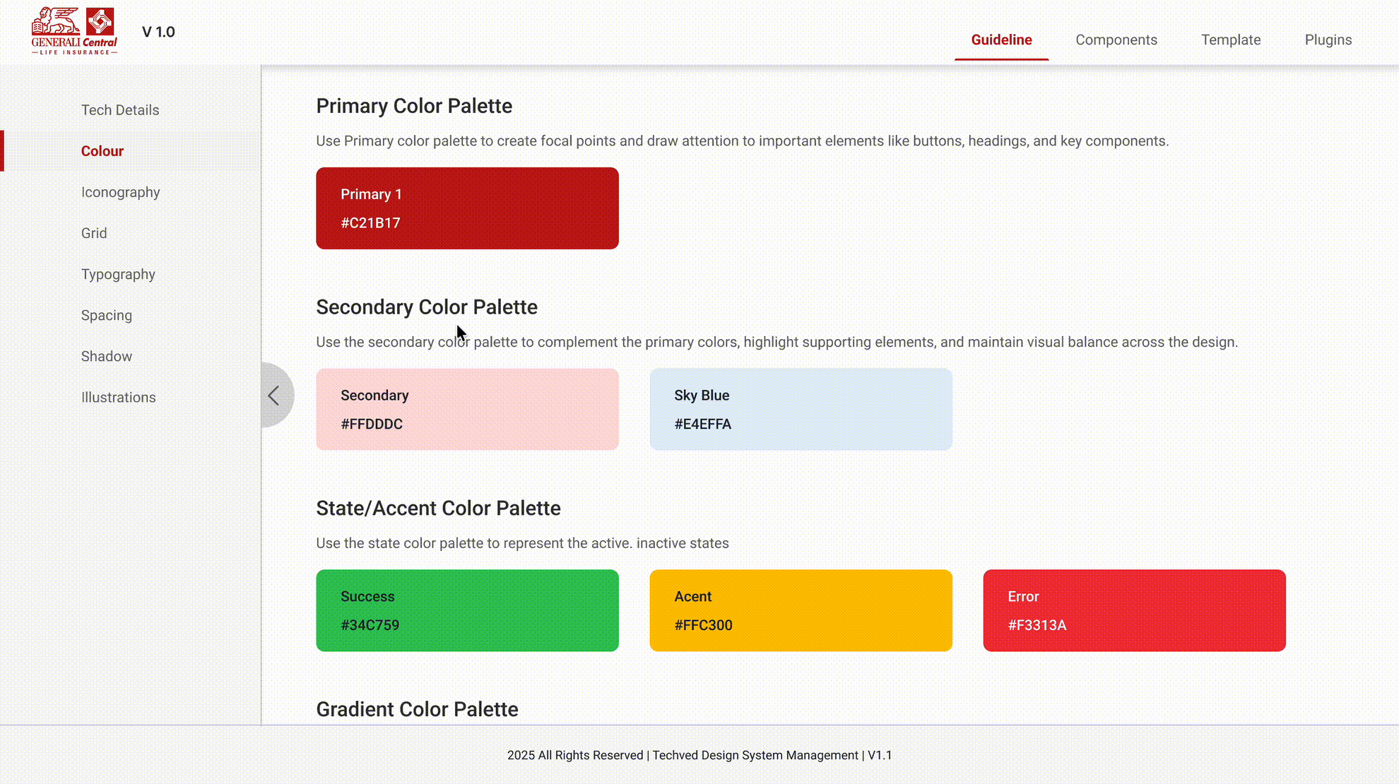
07 STYLE GUIDE
The Design Language
We Built.
A unified system of colors, typography, and components, ensuring every screen felt like the same brand
01
Brand color system
Brand red preserved across all touchpoints. Grays and border colors govern spacing and hierarchy.
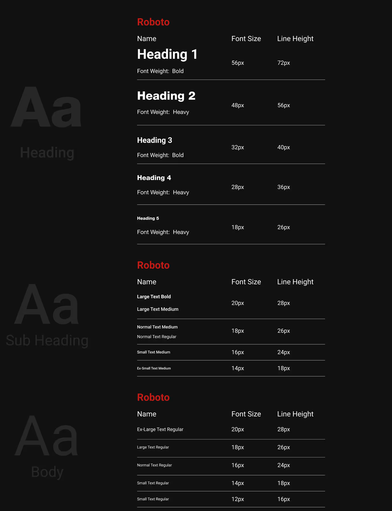
02
Typography Scale
Helvetica Neue chosen for clarity, critical for users processing complex insurance information.
03
Iconography & Icons
Line-style icons at consistent weights. Avatars add human warmth to an otherwise functional interface.

Design System in Motion
04
Design System
A complete design system created specifically for GCLI.
Every component, color, and interaction defined from the ground up for this project.
08 FINAL DESIGN
Where Strategy Became Screens
Every research insight, every design decision, every iteration, translated into a complete website experience.
Screens Delivered
120
+
Designed across every product category and user journey.
Product Categories
5
+
Term, Investment, ULIP, Group and Riders each with dedicated flows.
Journey Types
3
Persona based, Need based and VDA assisted mapped to each user intents.
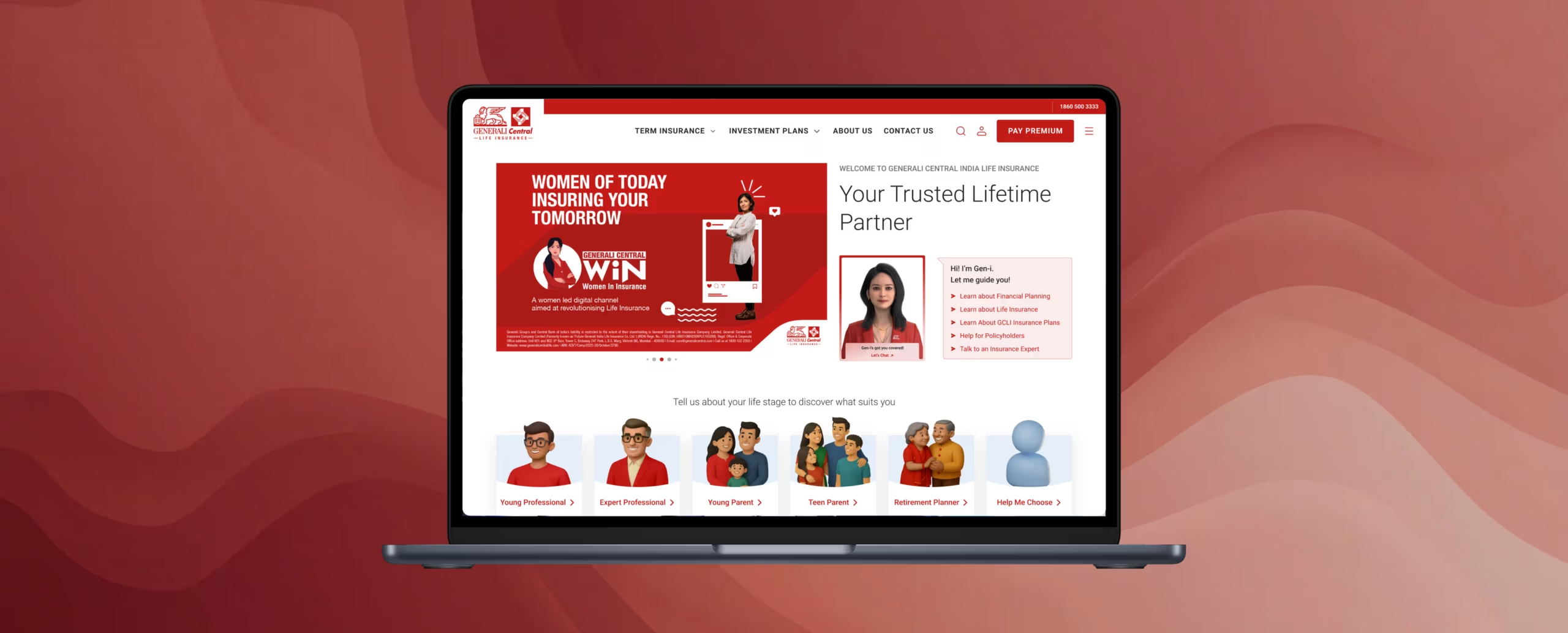
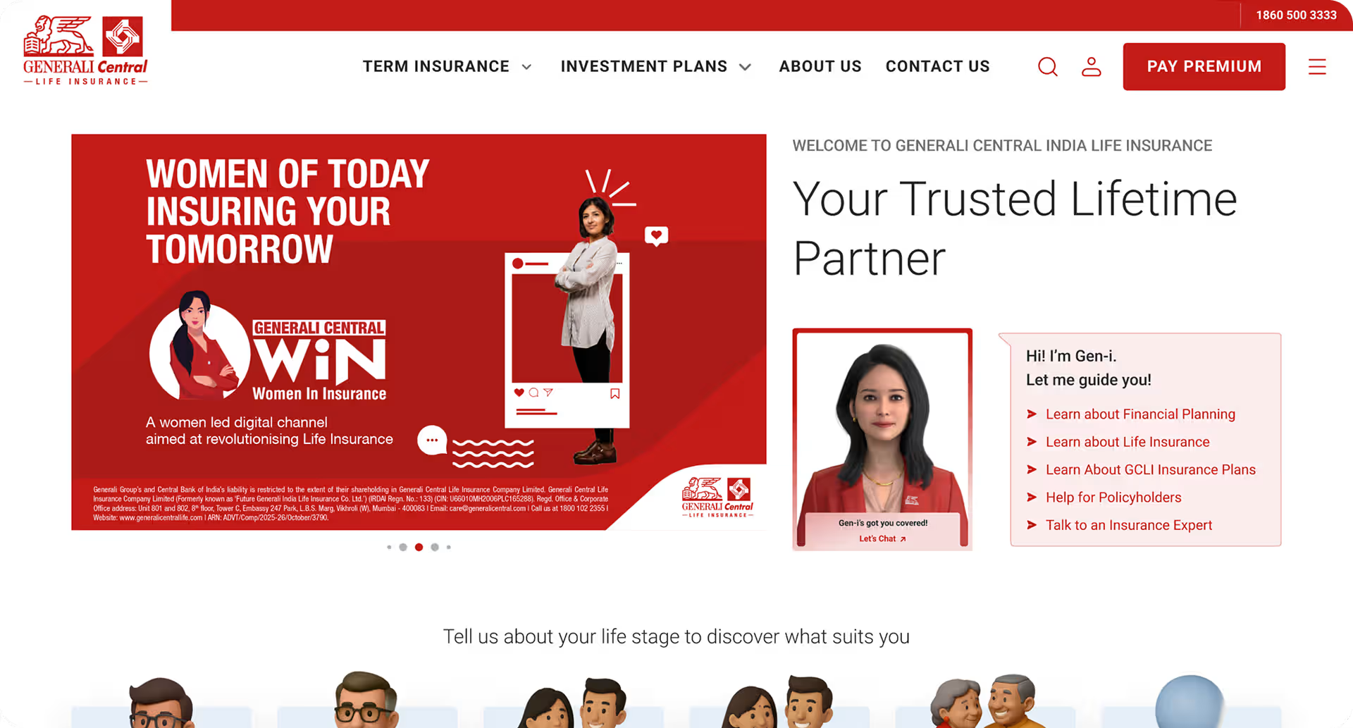
The Homepage
Designed to earn trust, guide users to the right plan and make help always available, without a single unnecessary click.
1
2
3
First Fold
Where Trust Begins
1. Persistent Navigation
All primary sections visible upfront. No hidden menus for core discovery.
2. Gen-i Always Present
AI assistant accessible from the first fold, users never need to search for help.
3. Hero Built for Campaigns
Flexible banner zone allows brand campaigns to run without disrupting the core page structure.
1
2
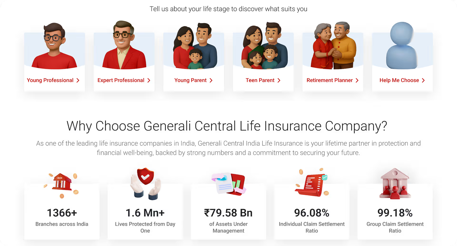
Life Stage Selector
Persona-Based Entry Point
1. Goal Before Product
Users identify their life stage before seeing any plans, matches how they think about insurance.
2. Assisted Discovery
Users who are unsure get a guided path, no dead ends in the journey.
1
2
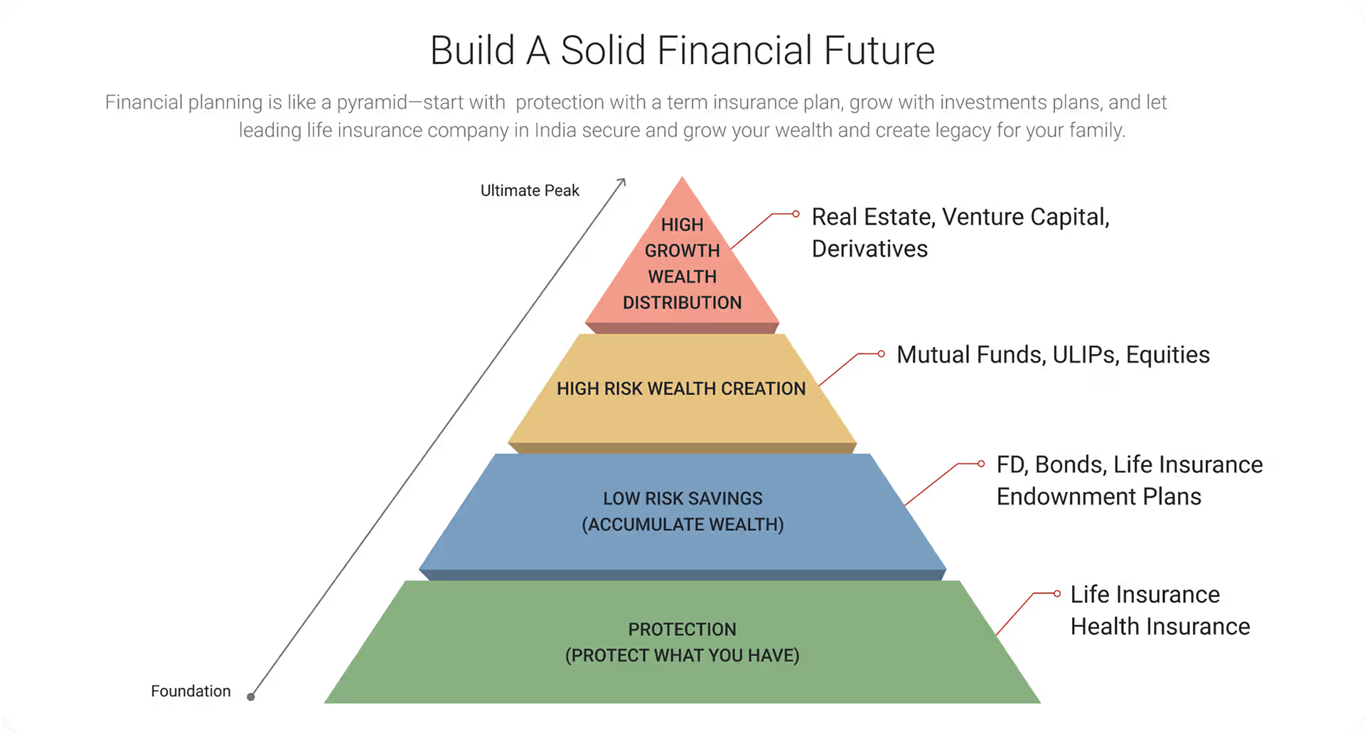
Financial Pyramid
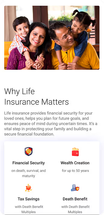
Educational Content That Builds Confidence
1. Insurance Literacy Built In
Research showed users didn’t understand insurance, this section educates before selling.
2. Context Before Choice
Users understand where each product fits in their financial plan before clicking explore.
1
2
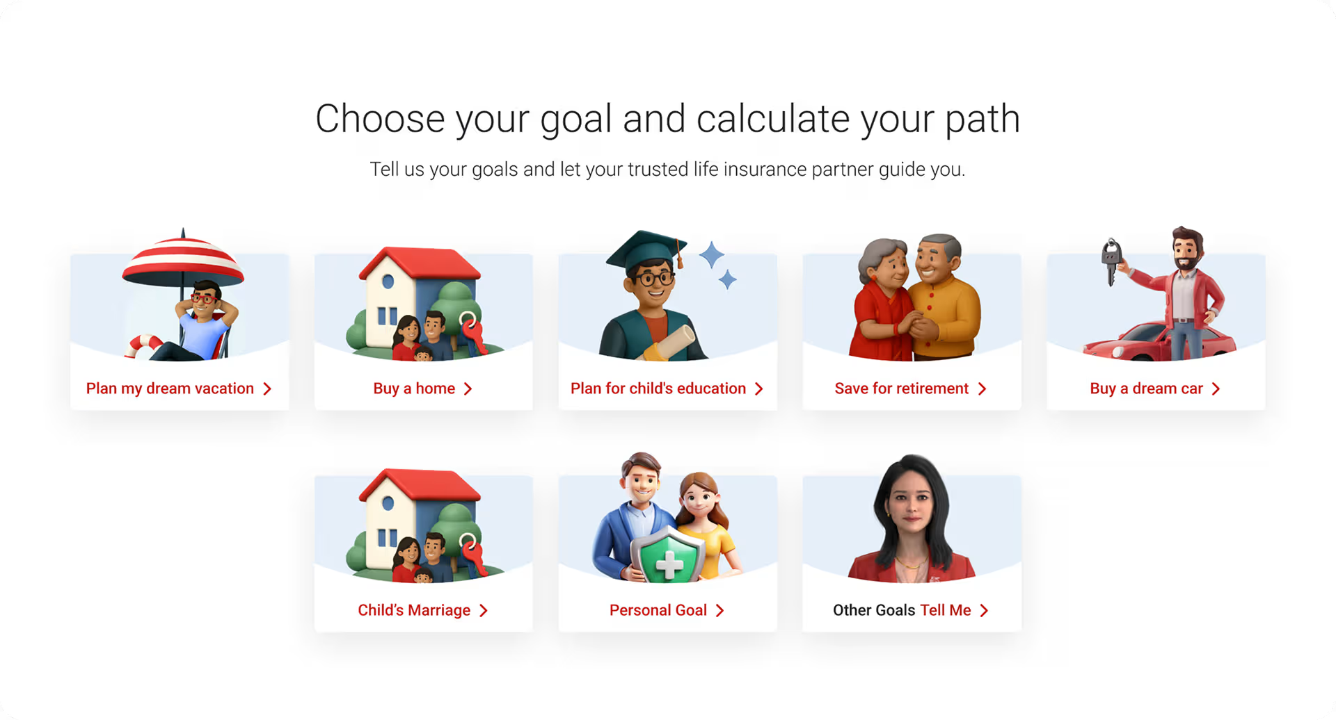
Goal Selector
Need-Based Journey
1. Start With a Goal
Users pick a financial goal, vacation, home, education, retirement not a product category.
2. No Wrong Answer
Users who don’t know their goal get a conversational path, the VDA handles ambiguity.
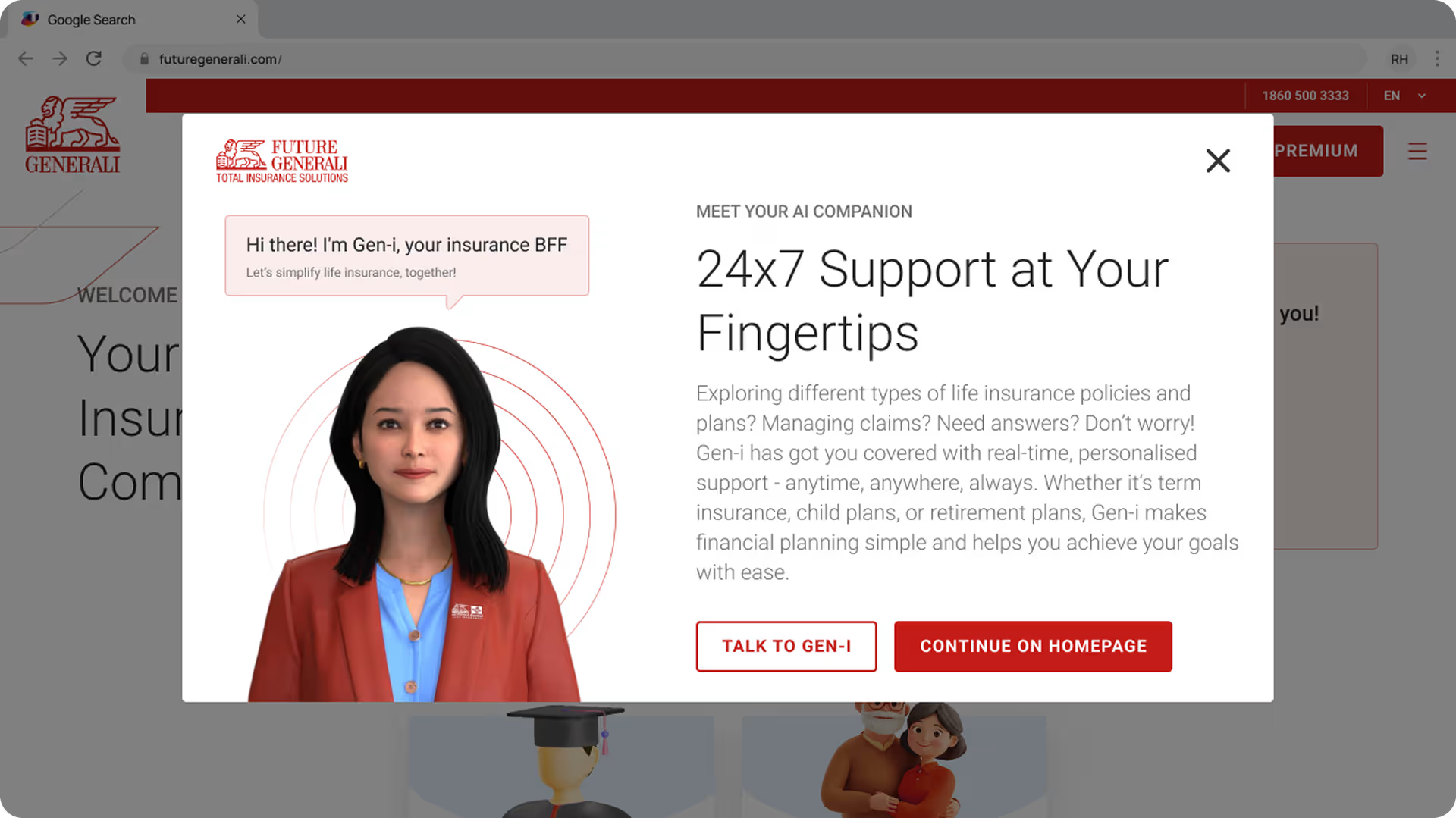
Gen-i — The AI Nobody Had Built Before.
An avatar-based Virtual Digital Assistant designed to simplify insurance, available 24x7, handling queries without human intervention.
1
2
3
VDA Intro
Meet Gen-i
1. Human Avatar by Design
A realistic avatar chosen over a chatbot icon, users trust a human face more than a robot symbol.
2. 24×7 Positioned as a Feature
Always-available support framed as a benefit upfront, sets expectation before the first interaction.
3. Two Clear Paths
Talk to Gen-i or continue browsing, users choose their comfort level, no forced interaction.
1
2
3
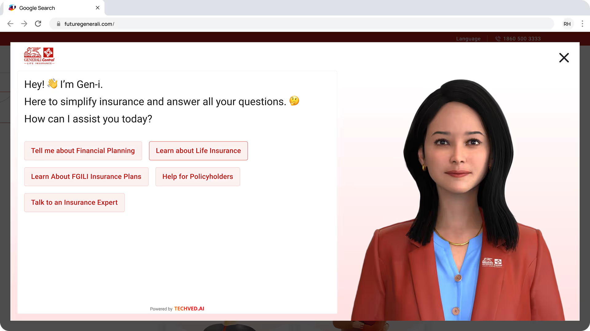
VDA Conversation
Guided From the First Message.
1. Conversational Tone
Gen-i speaks like a guide, not a form “How can I assist you today?” reduces intimidation.
2. Guided Prompts Eliminate Blank Input
Users never face an empty text box, five clear starting points remove the hesitation of not knowing what to ask.
3. Presence Without Distraction
Avatar visible but not dominant, attention stays on the conversation, not the visual.
VDA in Action
Watch Gen-i Work.
Gen-i VDA has its own detailed case study covering avatar research, conversation design, NLP training and live deployment.
Persona-Based Journey
A guided 8-step experience that takes users from life stage selection to a personalised plan recommendation without showing a single product catalogue.
Persona Journey
From Life Stage to the Right Plan.
1. Goal Before Product
Users start with their life stage, every recommendation filters around who they are, not what’s in the catalogue.
2. Education Before Decision
Why It Matters and Myths & Facts build trust through knowledge before asking for any commitment.
3. One Recommendation, Not Ten
After 8 steps users see one matched plan, choice overload was a primary reason users called an agent instead.
Product Detail Page
Every plan detail, trust signal and next step, designed to support a confident decision on any device.
09 OUTCOMES AND IMPACT
From Screens to Reality.
Scale, decisions, and real outputs from a 24-week design process that went from research to live product.
What Changed by Design
Three measurable decisions that directly reduced friction for users and complexity for the business.
215+
Fields Mapped and Rationalised
Mapped across products, reduced to 70+ mandatory fields, eliminating everything non-essential.
15 → 7
Buy Journey Steps
Every removed step was a potential drop-off point. Seven steps is what research said users would tolerate.
70%
VDA Query Handling Target
Industry benchmark the design was built to meet, Gen-i was designed to handle 70% of user queries without human intervention.
What Was Delivered
Four outcomes that moved from design files to real decisions, each one signed off, shipped, or greenlit.
Phase 1 - Live
Corporate Website
Redesigned website live and serving users across India.
Phase 1 - Live
Gen-i VDA
Avatar-based Virtual Digital Assistant live and handling queries.
Approved
Insurance Buy Journey
End-to-end purchase flow approved for development.
Achieved
Stakeholder Sign-off
Design signed off at leadership level with Phase 2 greenlit.
10 LEARNINGS AND REFLECTION
What This Project
Taught Me
Months of design work across India's most complex insurance products, three things I'll carry into every project that follows.
01
Trust Is Visual
Users decided whether to trust the site within seconds, before reading a word. Visual hierarchy earns credibility faster than copy ever could.
02
Simplify Relentlessly
Every field removed required more effort than any visual decision. Resistance to simplification always comes from inside the organisation, not users.
03
Reframe the Brief.
The client asked for a redesign. Research revealed a trust deficit. The best decision was identifying the real problem before touching a screen.

Closing Thoughts
The best design work doesn’t just solve the problem in front of you, it reveals the problem worth solving.
The website was the deliverable. Trust was the real brief.
Explore More Work
Designing the AI Nobody Had Built Before
Designing the AI Nobody Had Built Before
Where Parimatch Was Losing Its Users